Hug Reports

Crafting community artifacts to recognize the value of open-source developers and foster positivity within and around the development community


Sector Role Team Function Tools
Education Co-Creator Group (4) Mobile App Figma


Sector Role Team Size Function Tools
Community Visuals Lead Three VS Code Plugin p5.js
Live data visualization
Figma
Adobe Animate
00 Status Update
In progress. Received the Frank-Ratchye Studio CS + X Grant in 2025 to fund the visualization process with its shipping and physical placement around the university.
01 The Challenge (Opportunity!)
1) Unpaid volunteers toil for hours to create and maintain commonly used open-source packages.
2) Carnegie Mellon is ranked highly on lists of most depressed universities.
How do we cultivate a culture of gratitude and positivity, beginning with the Carnegie Mellon software development community?
1 year timeline.
02 Background (A need for...)
In most software development roles and coursework, we all build using tools that volunteer developers have made freely available as open-source projects (e.g., students use p5.js for creative coding and numpy for scientific computing).
Yet we, and most other users of these tools, rarely think to thank the developers and volunteers who develop these free tools. The goal of this work is to: 1) create the application to easily send a message (Hug Report) to the developers while coding, and 2) build a community artifact to inspire broader culture change: a digital installation visualizing the gratefulness.
03 Target Group & Research
Pranav's Khadpe, the HCI Lead's research is linked here. Based on the understanding and exploration of this paper and collaboration with him and our other team member, various concepts for the data visualization portion of 'Hug Reports' began.
After several rounds of discussion, we agreed that the final product would be tailored towards anyone who codes, with an initial focus on students at Carnegie Mellon University.
The final visual product needed to portray a sense of optimism even if there were few responses or Hug Reports sent, while incentivizing more responses with an aesthetically appealing, heartwarming visualization.
04 Ideation & Visual Style
We first conducted surveys asking users about their first impression of different styles of visualizations, focusing on three ideas:
what would convey the concept of a Hug Report and sense of optimism better, and whether there were aesthetic preferences in the user population.
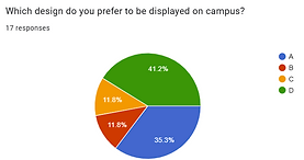


First round of research gauging interest in data visualizations.
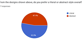
There was no initial preference for representational vs. abstract artwork, so we opted for the most popular sketch overall, then experimented with different color schemes, again testing for what invoked a sense of positivity.


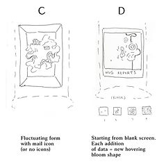
Further iterations of the initial visual concept for blooming hugs.
After further research, we selected a color palette and shape that corresponded with items that recalled physical connection and induced a sense of positivity in viewers.
Based on the various tests and ideations, the final idea for the data visualization's process is as follows: each time the Hug Report extension receives data, a new “bloom” forms, unfurls on the screen, and hovers there (or floats around). Over time, as more messages are sent, there should be a flowing, abstract art piece created by Hug Reports and students. The blooms shrink over time (after the message has been sent for a certain period of time, e.g. 1 month).